


Original Paint was a tannish color
It is now time to paint. My husband and I have decided to do the painting ourselves and save at least $3,000. That’s a good chunk of money, if you ask me.
Painting is not a small thing…that is why it costs so much to have professionals paint. And, if you are bad or inexperienced at painting, you probably shouldn’t tackle painting.

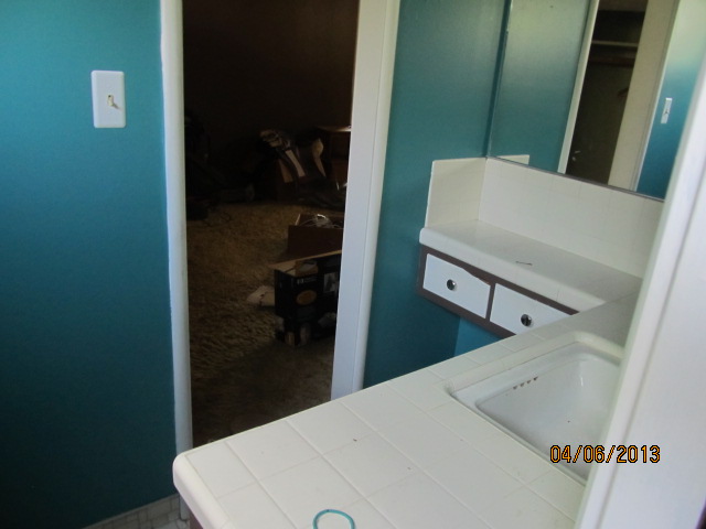
Not a good color choice
This may be fan appreciation (Lakers), but it’s really not a very good choice for the bathroom.
Here’s another bold choice for a bathroom (in this case it was the colors my kids painted the Master bathroom in the house we are remodeling.) I think we will stay away from repeating these colors.
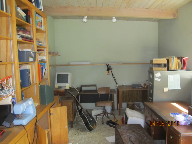
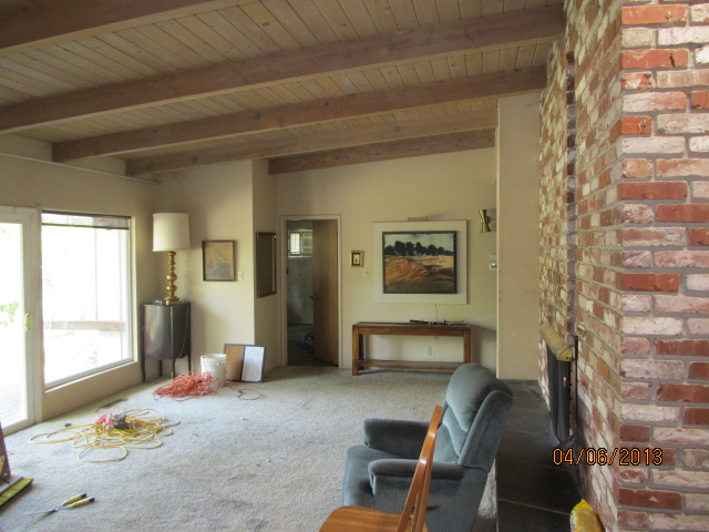
Original color in office
My parents chose a soft green for the office and the Master Bedroom. And, they did a soft green wash on the beautiful wood ceilings, dang it. I don’t think there’s much we can do about that.
So, my husband and I have looked at many, many example of mid century modern renovations and decided to go very neutral. Very neutral! We are going with white for the walls and the trim, stain for the doors and their trim and a medium turquoise for one wall in the Master Bedroom. That’s it. The color will come from the furnishings, paintings and other accessories. It sounds boring, especially since we have loads of color in the house we are presently living in. But, we want everything to be simple and understated except for accessories where we will allow ourselves to be more creative. For example: here is the fixture we bought for the dining room fixture.

Sputnik fixture
So, we are heading over to the house tomorrow to begin the paint job, which will be a huge job. I’ll take pictures tomorrow.
I will also have pictures of the bathtub and the bathroom tile tomorrow. I’m thinking it’s beginning to look pretty good.
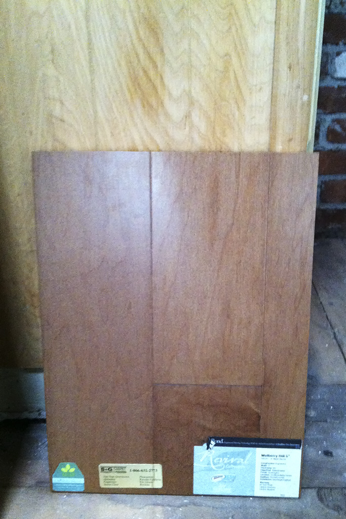
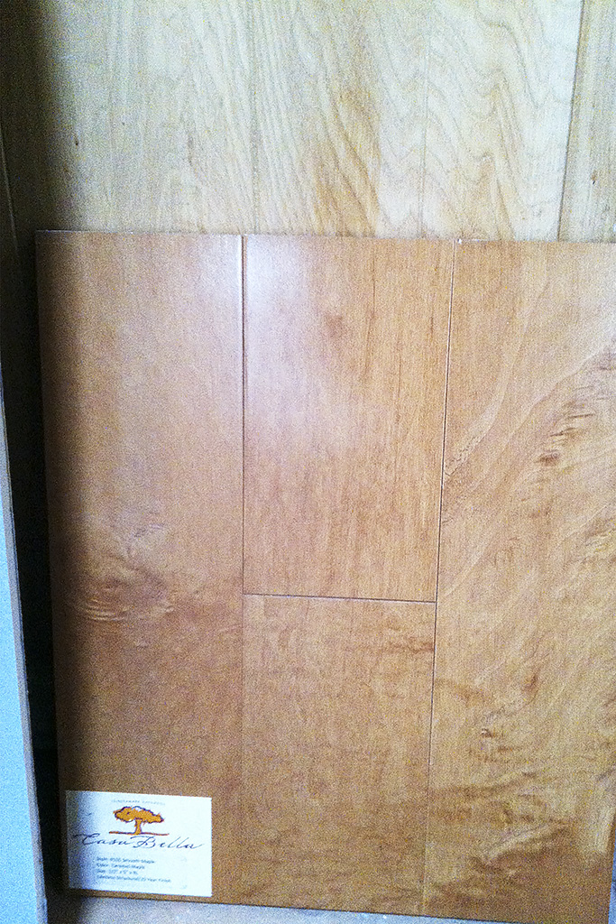
Below are the floor choices. This one is a little more reddish (to complement the bricks). The next one has more goldish tones, which I think I like a little better.
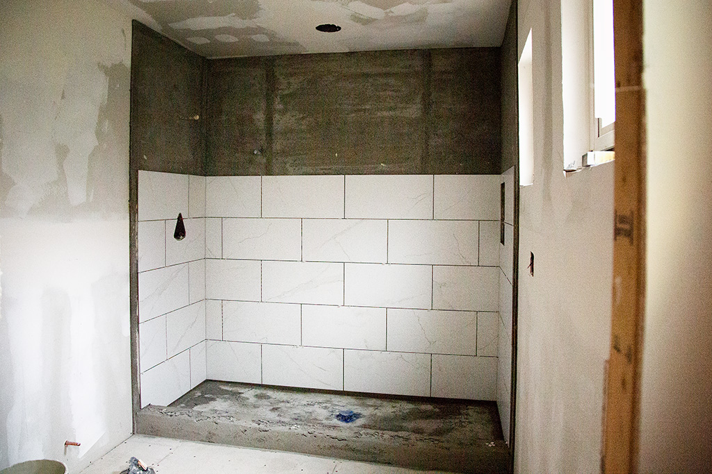
The shower tile (looks a little like prison tile right now) has a marble look, but it is ceramic tile The floor of the shower and the floor of the bathroom will be a gray tone.
The bathtub fills out the nook much better. Wait until you see it. It will make you swoon.

